Wednesday, September 29, 2010
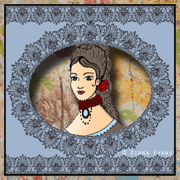
The Victorian Lady....which one do you prefer?
I did this piece and made it two ways ....She is a mysterious Victorian Woman...I don't know much about her....but I will find out....maybe I can hire an investigator....
The Three Muses want something Victorian so the first thing that always comes to mind for me is these amazing well dressed women who always had wonderful dresses and wonderful jewelry and wonderful hair!!!
I played with it two ways... I am partial to the top piece with my fun background work....
what do you think?
Subscribe to:
Post Comments (Atom)


16 comments:
Yes, I agree with you Diana, the top one is my preference, love the Victorian lacy border, too!
They are both charming pieces, very well done, but the first is most definitely my favorite!
These are both beautiful Diana but I really love the top one because of the depth and kind of 'pop-up' look to it. Wonderful background and setting for this lovely Victorian lady!
Both are beautiful, Diana but I love the first one. Lovely artwork.
I too love the background in the top piece. I love all your work.xx
They are both gorgeous Diana, but I think I like the first one best.
Very cute, Diana. Love them both but the top is my favorite. Love the addition of the little background showing through.
Have a great day! xoxo Diane
both are gorgeous but i'm partial to the first one too. it looks 3-D!
Such darling Victorian ladies Diana so prim and proper...lovely artwork as always.
While both backgrounds work, I like the top one best. I just love your illustrations, Diana.
they are both wonderful, but I am drawn to the top one, the background adds to the mystery.
How fortuitous for Old Fashioned and Victorian to collide this week! I love the elegance and charm of that era. She is beautiful, and I love her hairdo! I thought the top image might be a wonderful new popup card you created at first. :) Gorgeous flowery border, too.
And Oooooo, I'm loving your watercolor birds! So delicate and beautiful!
Gorgeous!! i like the top one best!!
LOVE the textured background to the first one... it add another level of authenticity to the period feel of the piece.
ALSO: be sure to check out the interview, that I posted on my blog. Thank you again for taking the time to do this. You shared some wonderful advice, encouragement and cheer!!! ;)
Ok... I love them both but if you want me to choose...lol....I'm going to go with door number 1.
xoxo
Yes, both are beautiful and I prefer the first one for the pretty background as opposed to the solid yellow. Great artwork as always, Diana.
Post a Comment